Today I am diving into the ongoing debate involving the ethics of AI removal tools in photo editing. How does it compare to past controversies like NatGeo’s infamous photo manipulation? Plus, get an inside look at the relaunch of Strohl Works with a new visual identity and get a few nice playlists to get into the creative flow.
On AI Removal Tools and Image Generation
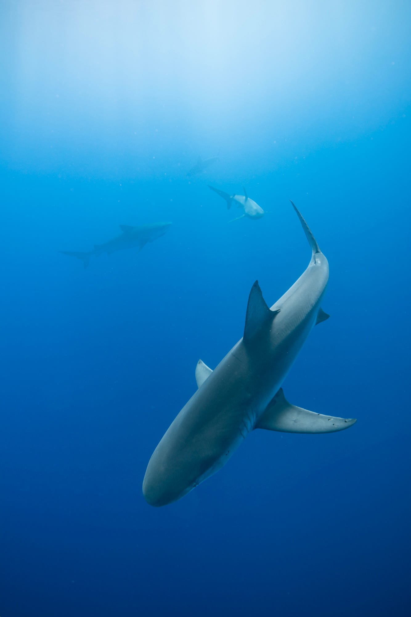
I was recently part of a debate about the ethics of AI removal tools in editing software like Photoshop / Topaz (etc). Things got heated. These tools are truly becoming better than humans at generating new parts of an image or removing things. But what are the ethics of the use of these tools? Coincidentally, this debate also happened when Photoshop came out in the late ‘90s, and even before that when photographers started messing with their negatives in the darkroom to dodge, burn, and sometimes clone stamp things out of an image
One of the most notable controversies around image manipulation was when NatGeo modified a horizontal photo of the Pyramids of Giza to fit in the vertical cover format. Here’s NatGeo’s defense:
“In February 1982 the magazine’s cover showed a camel train in front of the Pyramids at Giza. The image produced by the photographer was horizontal; here at headquarters we altered the photo to fit our vertical cover. That change visually moved the pyramids closer together than they really are.”
Modified image to fit in cover format:
But before we start blaming NatGeo, we must remember that Gahan paid the camel riders to ride back and forth in front of the pyramids so he could achieve the perfect shot. Honestly, I would have done the same thing, so it’s hard for me to blame him. But I’m also not a documentary photographer. I’m a commercial photographer, and my goal is to bring the images that are in my head to life…
Going back to the debate over generative AI in editing Apps, it seems there are two sides to the debate.
Those who believe the App makers have a responsibility to address the ethics of modifying images away from their captured state
Those who believe the App makers are only building tools and it is the responsibility of the user to do no evil (kind of reminded me of the gun debate here in the U.S.)
While I listened to both parties defending their points, I got bored and lost track of the argument. I actually don’t care about the debate, it turns out. We’ve had the same debate for years over these tools, and I find it boring, probably because I’m not such a purist or bound to the codes of photojournalism.
I mess with some of my images: I have removed distracting bits in the corner, moved a subject a bit to the left or the right to achieve a pleasing composition, I dodge and burn wherever I please, I fiddle with the tone curve to make the colors more to my liking… And I love it.
I do, however, draw the line at generating entirely different parts of an image. That’s not my cup of tea. I don’t care if others do it, so long as it’s made somewhat clear…
Per example:
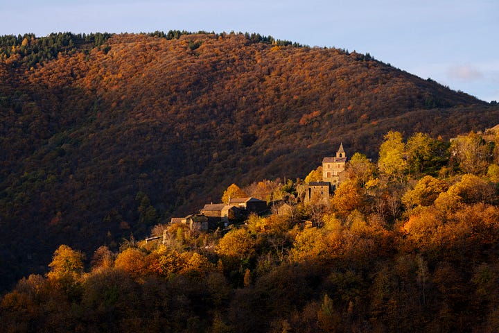
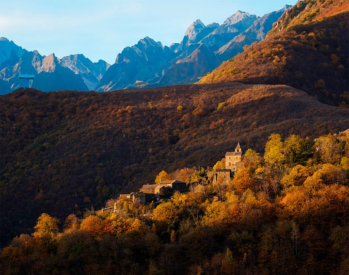
This to me is disingenuous, especially because most of the photographic experience for me resides in traveling to a location. There is even more value to me if I get to said location by ‘fair means’ of either running, biking, or any other human-powered mode of transport. So, the idea that I can add any mountain range I fancy to an image of the fields of Iowa doesn’t excite me…
Building the New Strohl Work: T-15
The relaunch of Strohl Works is only two weeks away, and it feels like crunch time. This being a personal project, I don’t have much support on it, so I have to work on ten different aspects of it at the same time. The website, finishing the first product (more on that in the next issue), building the imagery around it, and a lot of boring stuff too.
One of the best parts of this whole process has been making a new visual identity for the brand. I worked with Vince Chan out of Vancouver, BC, to develop the new logo. His main gig is running design at Aritzia, so I was thrilled to be able to work with him.
Hear from Vince himself about the development process:
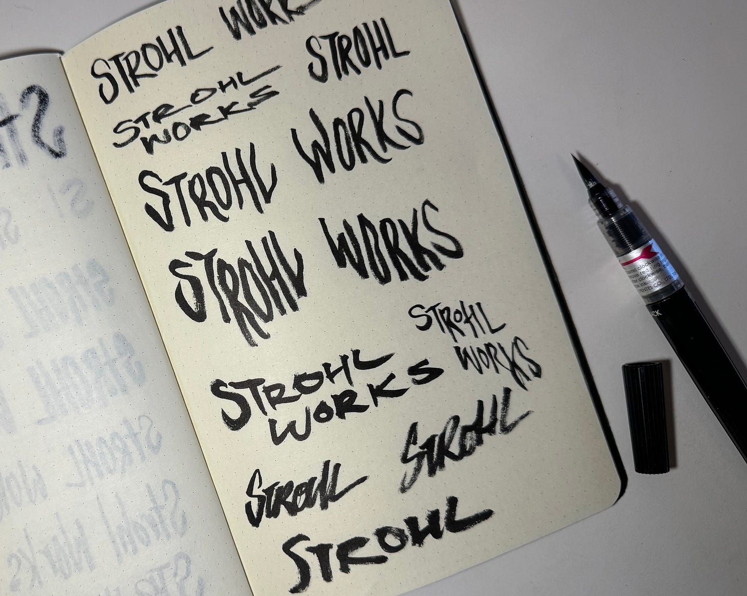
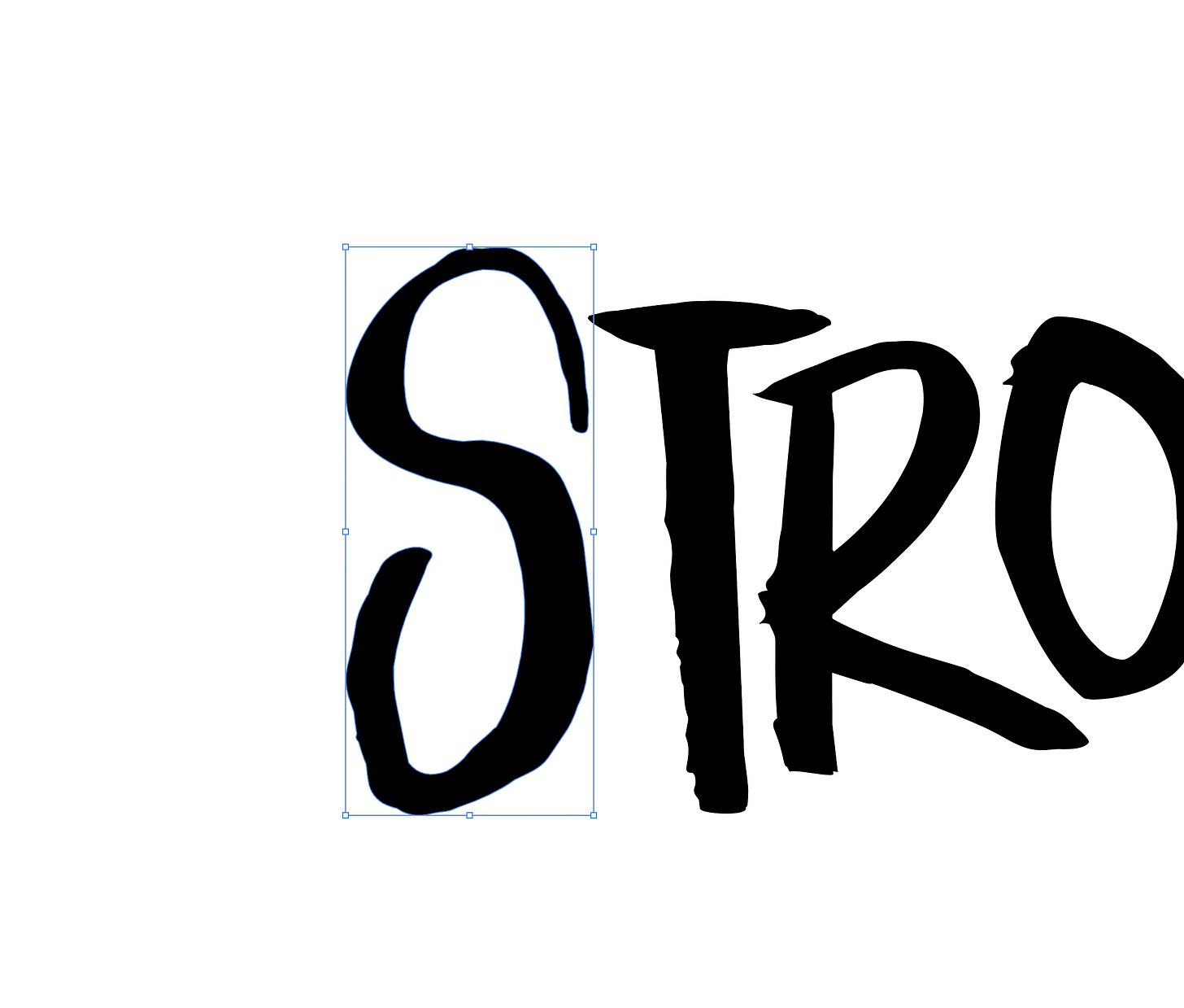
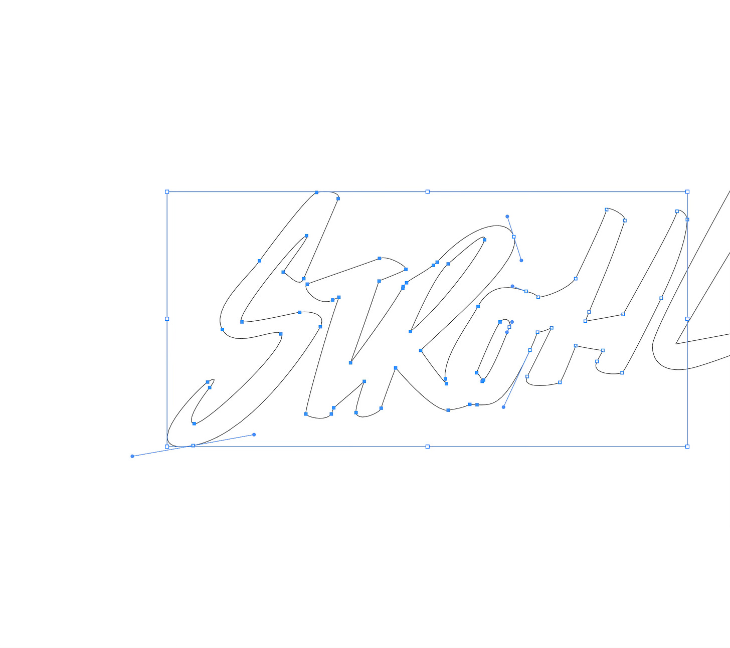
I don’t know about you, but I’m happy with this new aesthetic… The original Strohl Works was more typographical and serious; this one feels more explorative, almost freestyle, and that gives me a lot of cloud coverage to work on whatever product I’d like.
Dig the new logo? Leave a comment or shoot me an email with your thoughts. I read them all.
Follow along on @strohlworks or in this newsletter.
Watching
The Notebook Opening Scene: I love the imperfect compositions and how the entire scene is under exposed to make the colors pop. A good reminder to ditch technical perfection sometimes.
Casey Neistat’s Secrets to Filmmaking: The most intimate breakdown I have seen of Casey’s editing approach. It rivals with his entire studio.com course…
Curated Things
Nice Things: Steve and Alexia Booker just released their first clothing like called Nice Things and I love their Utility Pants
“Neu” Playlist on Spotify by Jared Chambers: Every two weeks or so I check in on Jared’s playlist. I’ll usually find a gem.
Editing Flow Playlist by yours truly: 28 hours of ambient music without lyrics to get in the editing flow. I’ve been working on this one for more than four years.
Reece Brown edits and proofreads this newsletter


The logo is bang on! Looking forward to the new project launch!
Love the new logo and how it is not so picture perfect. It has a more RAW feel to it, and I think it will play well with v2 of Strohl Works. Also I know you mentioned in your newsletter that you got a lot to do with Strohl Works, if you ever need any help at all, please let me know, I can be your guy for the job.